Business dashboards: how to build one people actually open
What a business dashboard is, the layers underneath it, which metrics belong on the first screen, realistic timelines, and how to avoid building yet another pretty report nobody uses.
Most dashboards die within a month. Everyone loves the demo, and a few weeks later the founder is back to asking someone to "send me the numbers in Slack." The tool is rarely the problem. Usually the dashboard answers questions nobody asked and stays silent on the ones that matter.
This guide covers how I build dashboards for small and mid-size companies: from questions to data, from data to a screen, and from the screen to a daily habit.
What a dashboard is, and what it isn't
A dashboard is one screen where someone can tell within a minute whether things are fine, and if they aren't, where the problem is. It isn't a warehouse of every chart you could draw, a replacement for spreadsheets or an investor deck.
It helps to separate three kinds:
| Type | Audience | Question | Cadence |
|---|---|---|---|
| Strategic | founder, CEO | are we growing, where is the money | weekly |
| Operational | manager, marketer | what broke yesterday, what to do today | daily |
| Analytical | analyst | why did it happen | ad hoc |
The classic mistake is cramming all three onto one screen. The CEO sees 40 widgets and closes the tab.
Start with questions, not charts
My first call with a client is never about visuals. I ask them to write down 5–10 questions they ask every week:
- What did we make last week, and is that more or less than usual?
- Which ad channel pays for itself and which doesn't?
- Why did leads drop on Tuesday?
- How many customers come back for a second order?
Each question becomes a metric with a precise definition, a source and a threshold that triggers action. A metric that doesn't lead to any action doesn't belong on the first screen.
A metric definition template
| Field | Example |
|---|---|
| Name | Repeat purchase rate |
| Formula | customers with ≥2 orders / all customers in period |
| Source | store backend or CRM (orders), not GA4 |
| Refresh | daily at 07:00 |
| Normal range | set from your own history, not an industry blog post |
| Action when off | check email flows and stock of best-sellers |
I keep these in a metric dictionary, which later becomes the tooltips inside the dashboard.
What sits underneath the screen
The pretty screen is the tip of the iceberg. Underneath are four layers:
- Sources: GA4, Google Ads, Meta Ads, the CRM (HubSpot, Pipedrive and the like), the store platform (Shopify, WooCommerce), payments (Stripe, PayPal), spreadsheets.
- Pipeline: scheduled extraction and cleaning (ETL). See data pipelines for small businesses.
- Warehouse and model: BigQuery or PostgreSQL holding single-source-of-truth tables for orders, customers, spend and sessions.
- Visualisation: a custom workspace, Looker Studio, Power BI or Metabase.
When a dashboard "shows the wrong numbers," the cause is almost always in layers 1–3. That's why I don't touch design until tracking has been audited (audit checklist).
What goes on the first screen
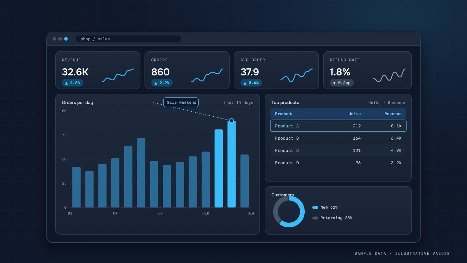
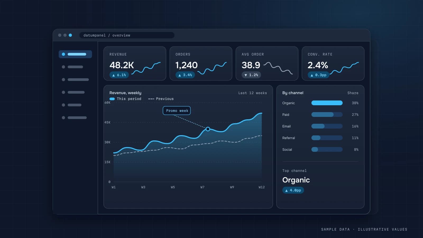
A rule that works: 4–6 KPIs on top, one main chart, one detail table.
For every KPI, show:
- the value for the period;
- the comparison with the previous period, or the same week last year;
- colour that respects polarity (refunds going up is bad, even though the arrow points up);
- a one-line note on how it's calculated.
First-screen sets by business type:
| Business | First screen |
|---|---|
| Online store | revenue, orders, AOV, conversion rate, ROAS, repeat rate |
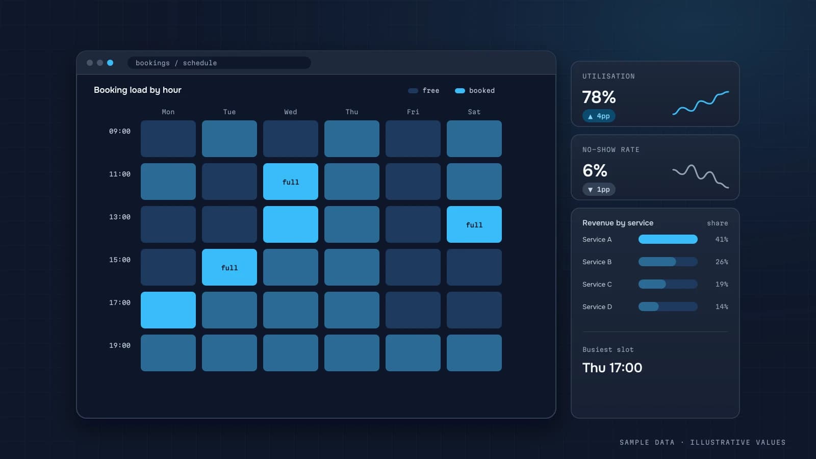
| Service business | bookings, utilisation, no-shows, cost per booking, revenue per staff |
| SaaS / app | MRR, new subscriptions, churn, activation, crash-free users |
| Agency | client spend, CPA/ROAS per client, pacing vs plan |
Each one gets its own article: ecommerce dashboards, service business analytics, SaaS metrics, agency client reporting.
Design that stays out of the way
A few principles I always apply. More of them are in dashboard design best practices.
- The most important number sits top-left, because that's where people start reading.
- Number formats are consistent: thousands separators, currency, decimals.
- No 3D, no nine-slice donuts, no decorative gradients.
- Colour encodes meaning (good/bad, category), not mood.
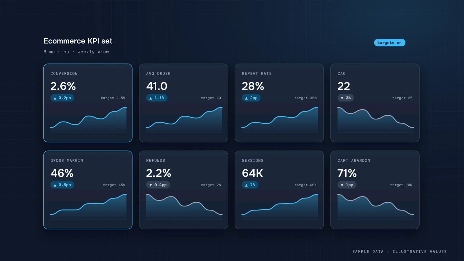
- The trend matters more than the exact figure, so put a sparkline next to each KPI.
- There's a mobile view for the founder who checks numbers in a taxi.
Off-the-shelf BI or a custom workspace
The short version: if you have an analyst who wants to slice data themselves, BI tools like Power BI and Looker Studio are great. If the dashboard is for non-technical people, and branding, metric explanations, chat-based reports and data on your own server matter, a custom workspace is often simpler and cheaper over time. The full comparison is in Power BI vs Looker Studio vs Metabase and custom dashboard vs BI. For a one-off report on finished tables, a static micro-dashboard may be all you need.
Realistic timelines
These are timelines for a solo analyst:
| Phase | Duration |
|---|---|
| Data audit and metric dictionary | 3–5 days |
| Tracking fixes | 1–2 weeks (depends on your developers) |
| Pipelines and data model | 1–3 weeks |
| Dashboard and reports | 1–2 weeks |
| Training and iteration | 1–2 weeks, in parallel with real use |
That adds up to 2–4 weeks for a proven niche template and 4–8 weeks for end-to-end analytics. Code isn't what eats the time. Access requests and reconciling discrepancies are.
Getting people to use it
- Bring the numbers to where people already are. A short morning summary in Telegram or Slack with a link to the dashboard works well. See automated KPI reports.
- Explain changes. "Revenue −12% because campaign X was paused" beats a bare −12%. An AI assistant on your data helps here.
- Give every metric an owner, someone who acts when it goes off track.
- Review the KPI set quarterly and delete what nobody looked at.
Checklist for a good dashboard
- There's a written list of the questions it answers
- Every metric has a formula, a source and an owner
- Numbers are reconciled with the CRM or accounting, and any gaps are explained
- The first screen holds 6 KPIs or fewer, each with a comparison and a trend
- Data refreshes automatically and shows when it was last updated
- There's a mobile view or a chat summary
- Access is role-based
A worked example: from questions to a metric tree
Here is how the process from "start with questions" plays out for a hypothetical online store doing a few hundred orders a month. All numbers below are illustrative.
The owner's real questions, as written down in the kickoff call:
- "Are we making money this month, or just revenue?"
- "Which ad channel should get next month's budget?"
- "Are customers coming back?"
Each question becomes one top-level metric, and each metric breaks down into drivers you can act on:
| Question | Top metric | Drivers (what you can change) |
|---|---|---|
| Making money? | Contribution margin | revenue, COGS, shipping, payment fees, ad spend |
| Where to put budget? | Contribution margin by channel | spend, new customers, AOV, margin per order |
| Coming back? | Repeat purchase rate in 90 days | first-order experience, email flows, assortment |
The tree matters because it tells you what to do when the top number moves. If contribution margin drops, you look one level down: did revenue fall, did shipping costs rise, or did ad spend jump without new customers? A dashboard that shows only the top number creates anxiety; one that shows the tree creates decisions.
The sample calculation
Suppose last month looked like this:
| Line | Amount |
|---|---|
| Revenue (paid, net of refunds) | 1,000,000 |
| COGS | −520,000 |
| Shipping and packaging | −70,000 |
| Payment fees (~2%) | −20,000 |
| Ad spend | −180,000 |
| Contribution margin | 210,000 (21%) |
If next month ad spend rises to 240,000 and revenue to 1,100,000 with the same cost structure, margin becomes 1,100,000 × (1 − 0.52 − 0.07 − 0.02) − 240,000 = 189,000. Revenue grew 10%, margin fell 10%. This is exactly the kind of situation a revenue-only dashboard hides, and why contribution margin belongs on the first screen.
Write the metric definitions before any chart
Every metric on the dashboard needs a one-line definition the whole team agrees on. I keep them in a simple table that lives next to the dashboard:
| Metric | Definition | Source | Refresh | Owner |
|---|---|---|---|---|
| Revenue | sum of paid orders minus refunds, excl. VAT | orders, refunds | daily 07:00 | owner |
| New customer | customer whose first paid order falls in the period | orders | daily | marketing |
| CAC | ad spend / new customers | ad platforms, orders | daily | marketing |
| Repeat rate 90d | share of customers with 2+ orders within 90 days of the first | orders | weekly | owner |
Three rules make this table useful:
- One definition per name. If finance and marketing mean different things by "revenue", you need two names, not one argument.
- Write the exclusions. VAT, test orders, cancelled orders, internal orders, gift cards. Most disputes live in the exclusions.
- Name an owner. Someone answers when the number looks wrong.
The summary table under the dashboard
Charts should not run heavy queries on raw data. I build one daily summary table and point every chart at it. In BigQuery or PostgreSQL the core looks like this:
-- daily_summary: one row per day and channel
SELECT
  o.order_date                         AS day,
  COALESCE(o.channel, 'unknown')       AS channel,
  COUNT(DISTINCT o.order_id)           AS orders,
  COUNT(DISTINCT CASE WHEN o.is_first_order THEN o.customer_id END) AS new_customers,
  SUM(o.revenue_net)                   AS revenue,
  SUM(o.cogs + o.shipping + o.payment_fee) AS variable_costs,
  MAX(s.spend)                         AS ad_spend
FROM orders o
LEFT JOIN ad_spend_daily s
  ON s.day = o.order_date AND s.channel = o.channel
WHERE o.status = 'paid' AND NOT o.is_test
GROUP BY 1, 2;
Two details are easy to get wrong. First, spend is joined at day-and-channel level and taken once (MAX), otherwise it multiplies by the number of orders. Second, channels that spent money but produced zero orders disappear from an inner join, so in production I build the date-channel grid first and join both orders and spend to it.
Data quality checks that run every day
A dashboard loses trust after the first wrong number nobody caught. Cheap automated checks prevent most of it:
- Yesterday's row exists for every active channel
- Orders in the summary match orders in the CRM for yesterday (±1–2% for timing)
- Ad spend is not zero for channels with active campaigns
- No negative revenue days unless refunds explain them
- The refresh finished before the time people open the dashboard
When a check fails, the message goes to the person responsible, and the dashboard shows a "data delayed" banner instead of silently showing a partial day.
Common mistakes
| Mistake | Why it hurts | What to do instead |
|---|---|---|
| Building the dashboard before agreeing on definitions | every meeting turns into "whose number is right" | definitions table first |
| Showing today's partial day next to full days | looks like a collapse every morning | show yesterday by default, today labelled as partial |
| Mixing GA4 revenue and CRM revenue | two numbers that never match | pick the CRM or payments as the money source, GA4 for behaviour (why they differ) |
| One giant screen for everyone | nobody finds their part | one screen per role |
| No owner after launch | it slowly drifts out of date | name an owner and a monthly review |
How to tell after a month whether it works
Launch isn't the finish line. After 4–6 weeks I check a few plain signals:
- People open it. Most BI tools and custom workspaces show view stats. If the owner's screen was opened twice in a month, it isn't answering their questions. Talk about it rather than waiting.
- It shows up in decisions. "We cut the budget on channel X because its margin has been negative for three weeks" means the dashboard works. "We looked, it was interesting" doesn't.
- The manual spreadsheets are gone. If a manager still assembles the same report in Excel every week, something is missing. Find out what.
- The questions get deeper. "How much did we sell?" turns into "why is the repeat rate lower in category Y?" That's a good sign: the basics are answered and you can add the next level.
Then do a short iteration: remove widgets nobody looks at, add the one or two metrics that were missing, and tighten the definitions that caused arguments. The second version of a dashboard is usually far more useful than the first, and that's normal.
FAQ
How much does a business dashboard cost?
It depends on the number of sources, the state of your tracking and whether you want ongoing support. A proven niche template wired to your sources costs far less than building from scratch. I give a firm quote after a short access audit.
Can I start with Google Sheets?
Yes, and it's often the right first step for validating metrics. The limits of that approach are covered in Google Sheets dashboards.
How often should the data refresh?
For most businesses, a nightly refresh is plenty. Hourly makes sense when decisions happen during the day, for example with large ad budgets.
Who should have access?
Typically founders and leads see everything and managers see their own sections. In a custom workspace, access is role-based, and login can be protected with password + TOTP, Cloudflare Access or a corporate VPN.

DATUMPANEL — Business data analytics
DATUMPANEL is an independent data analyst based in Ukraine. I build dashboards for business owners, set up GA4 and the BigQuery export, and run data pipelines and Telegram auto-reports for e-commerce, service businesses, SaaS and agencies, from data audit to decisions.