Dashboard design: 12 rules so people actually use it
Practical rules for business dashboard design (hierarchy, chart choice, comparisons, colour, accessibility, mobile), with typical mistakes and a pre-launch checklist.
A dashboard nobody uses costs as much as a useful one. The cause is usually the presentation, not the data: too many charts, no way to tell good from bad, and nothing readable on a phone. These are the rules I apply on every project.
1. One decision, one screen
Before you design anything, write down who looks at the screen, how often, and what they decide. "Every Monday the owner decides how to reallocate ad budget" is the brief for a screen. More in the business dashboard guide.
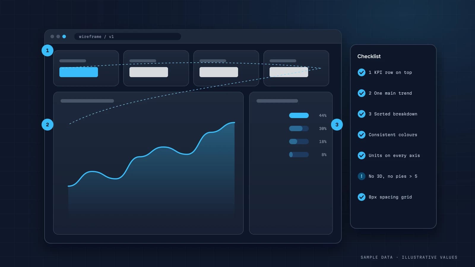
2. Hierarchy: the important stuff on top
| Zone | What goes there |
|---|---|
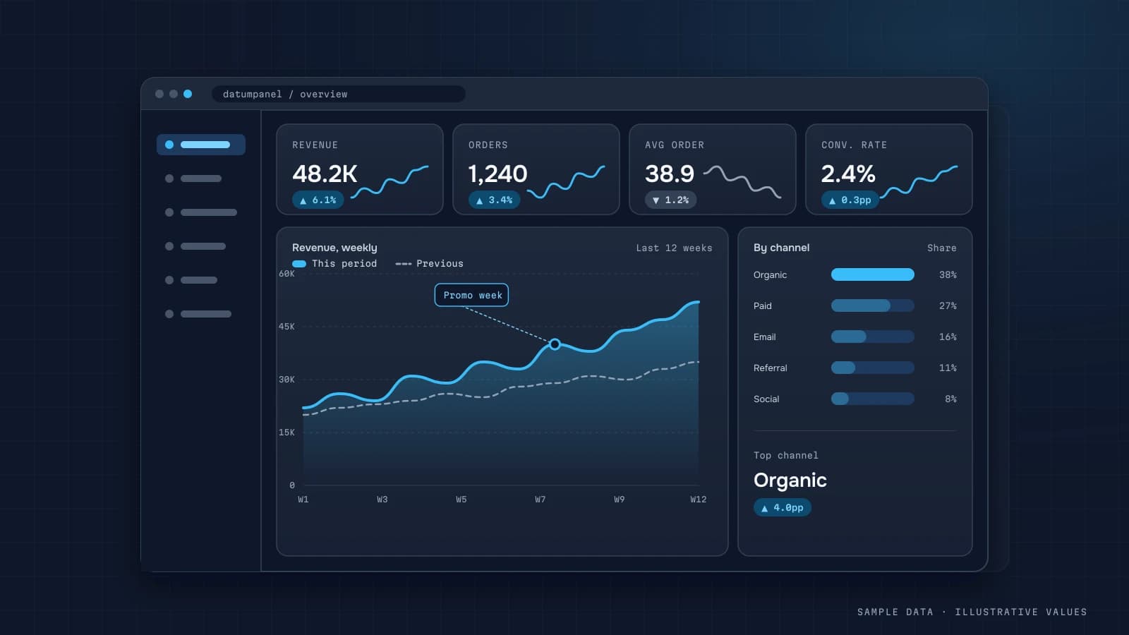
| Top | 4–6 key metrics (KPI cards) |
| Middle | trends for the main metrics |
| Bottom | breakdowns and tables for detail |
Eyes read top to bottom and left to right, so the most important number belongs in the top-left corner.
3. Every number needs context
"Revenue $41,200" says nothing. "$41,200, +8% vs last month, 92% of plan" does. Pair each KPI with the previous period, the plan, or the same period last year.
4. The right chart type
| Task | Chart |
|---|---|
| Change over time | line |
| Comparing categories | sorted horizontal bars |
| Part of a whole (2–4 parts) | stacked bar; pie only for 2–3 parts |
| Distribution | histogram |
| Relationship between two metrics | scatter |
| Exact values | table |
Avoid 3D, gauges, and pie charts with ten slices.
5. No more than 7–9 widgets per screen
If you need more, that's another screen or another audience.
6. Colour carries meaning
- Use a neutral base (grey plus one brand colour).
- Keep red and green for bad and good only.
- Give a channel the same colour on every chart.
7. Not colour alone
About 8% of men have colour vision deficiency (per the NEI). Back colour up with symbols (▲▼), labels or shape. Text contrast should be at least 4.5:1 per WCAG.
8. Bar chart Y-axis starts at zero
A truncated axis can make a 3% difference look like double. Line charts can start above zero, but label the scale clearly.
9. Clear names and definitions
"CR" means what, to whom? Write "Checkout conversion rate" and put the formula in a tooltip. A chart title can be the takeaway, for example "Repeat purchases up for the third month".
10. Few filters, applied consistently
Put period, channel and region in the header, and have them apply to the whole screen. Always show the current filter state.
11. Design the mobile view on purpose
Owners often check dashboards on their phones. On a narrow screen, put KPI cards in one column, make charts full width, and either let tables scroll horizontally or trim them to the top 5. For simple cases a static micro-dashboard works well.
12. Show data freshness
"Updated: today 07:00" in the corner answers half of the "is this current?" questions.
Typical mistakes
| Mistake | Result | Fix |
|---|---|---|
| Every metric on one screen | nobody finds what matters | split by audience |
| No comparison | can't tell good from bad | add period or plan |
| Different definitions across reports | no trust | a single metric glossary |
| Slow loading | people stop opening it | aggregates, caching |
Pre-launch checklist
- Audience and decision written down for each screen
- 4–6 KPIs on top, with comparisons
- Chart types match their tasks
- Colour isn't the only signal; contrast ≥ 4.5:1
- Metric definitions in tooltips
- Tested on a phone
- Data refresh time visible
- Loads within a few seconds
Worked example: redesigning a cluttered screen
A typical "before" screen in an illustrative store dashboard: 18 widgets, including 6 pie charts, two gauges, a table with 25 columns, revenue in three different places (one with VAT, two without), and no comparisons.
The redesign, step by step:
- Interview the main user, the owner here: "Every Monday I decide whether to change ad budgets and whether to restock bestsellers."
- Keep only widgets that serve those two decisions. That leaves 7.
- Put the four KPIs on top: revenue, orders, contribution margin and ad spend, each with "vs last week" and "vs plan".
- Replace the pie charts with one sorted bar chart: margin by channel.
- Replace the 25-column table with a top-10 products table of 5 columns: units, revenue, margin %, stock days left, and the change.
- Unify revenue to one definition, with a tooltip.
- Move the rest to a second "Details" screen for the marketer.
| Before | After | |
|---|---|---|
| Widgets on first screen | 18 | 7 |
| Time for the owner to answer "are we OK this week?" | couldn't say | under 30 seconds |
| Revenue definitions on screen | 3 | 1 |
The test in the last row comes from the checklist below. Use it on your own screens: ask the intended user to answer their main question while you time them.
Number formatting rules
Small formatting choices decide whether a screen reads instantly or needs squinting:
| Rule | Example |
|---|---|
| Round KPIs to what matters | 1.24M, not 1,243,817.32 |
| Same unit and precision within a column | all values in thousands, one decimal |
| Show changes as percentage points for rates | conversion 1.6% → 1.9% is "+0.3 pp", not "+19%" (or show both, clearly labelled) |
| Thousands separators per locale | 1 243 817 in Ukrainian, 1,243,817 in English |
| Negative numbers clearly marked | −12% with a ▼, not just red |
| Dates unambiguous | 14 Oct 2026 or 2026-10-14, never 10/14 vs 14/10 confusion |
Right-align numbers in tables so digits line up, and use tabular (monospaced) figures if your font supports them.
Tables that work
Tables are often the most-used part of a dashboard, and the least designed:
- Default sort answers the main question (worst performers first for a review screen)
- 5–7 columns on the first view; more behind a toggle or in an export
- Conditional formatting only on the one column that matters, not everywhere
- Totals row at the top or clearly separated at the bottom
- Row limit with a "show all" link; nobody reads row 87
- Sticky header and first column on mobile
Annotations: the cheapest context
Mark events directly on time-series charts: a price change, a site release, a big campaign launch, a tracking fix. A small dot with a note ("checkout fix, 14 Oct") saves a meeting's worth of "what happened here?" Keep the annotation list in a simple table in the warehouse so every chart can read it, and add entries as part of your weekly routine.
Accessibility beyond colour
Accessible dashboards are easier for everyone to read. Beyond contrast and colour-blind-safe palettes:
- Charts have a short text summary for screen readers (and for people skimming)
- Interactive elements are reachable by keyboard, with visible focus
- Font size at least 14 px for labels, 12 px for footnotes
- Don't rely on hover alone for key numbers, because hover doesn't exist on touch screens
See the WCAG 2.2 quick reference for the full list of criteria.
FAQ
How many screens should a dashboard have?
As many as you have distinct audiences and decisions. Small businesses often need 3–5: overview, marketing, sales and finance.
Do I need a designer?
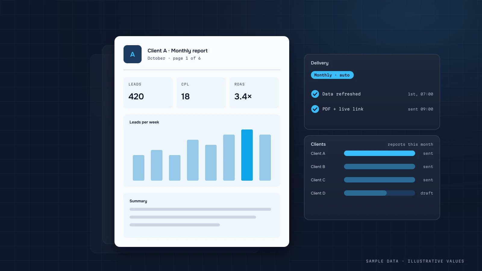
For an internal dashboard, following the rules above is enough. For a client-facing product or agency client reports, design pays for itself.
Dark or light theme?
Both work if contrast holds. Consistent colours and readability matter more.
How do I check the dashboard is clear?
Give it to someone from the target audience and ask them to say within 30 seconds whether things are OK. If they can't, simplify.
DATUMPANEL — Business data analytics
DATUMPANEL is an independent data analyst based in Ukraine. I build dashboards for business owners, set up GA4 and the BigQuery export, and run data pipelines and Telegram auto-reports for e-commerce, service businesses, SaaS and agencies, from data audit to decisions.