Static micro-dashboards on GitHub Pages or Vercel: fast reports without BI
What a static micro-dashboard is, when it's enough instead of BI, how to build one from CSVs, Google Sheets or exports in a few days, and how to publish it on GitHub Pages or Vercel with access protection.
Not every question needs a pipeline, a warehouse and BI licences. An annual investor update, a campaign post-mortem, a research summary or a dashboard for a conference talk are one-off or rarely updated pieces. A static micro-dashboard works well for them: one or two pages of charts, built from finished data and published like any other website.
What it is
A static micro-dashboard is an HTML page with the data baked in at build time:
- data: CSV, JSON, Google Sheets, or an export from your CRM or BigQuery;
- charts: a JavaScript visualisation library;
- hosting: GitHub Pages, Vercel, Netlify or any static host;
- updates: rebuilt by hand or on a schedule (for example, daily via GitHub Actions).
There's no server, no database and no licence, so it's cheap, fast and hard to break.
When it's enough
| Situation | Micro-dashboard | Full workspace / BI |
|---|---|---|
| Quarterly investor update | ✓ | |
| Campaign or season results | ✓ | |
| Public infographic or research | ✓ | |
| Daily sales monitoring | ✓ | |
| Roles and access for many users | ✓ | |
| Data that changes hourly | ✓ | |
| Interactive drill-down on millions of rows | ✓ |
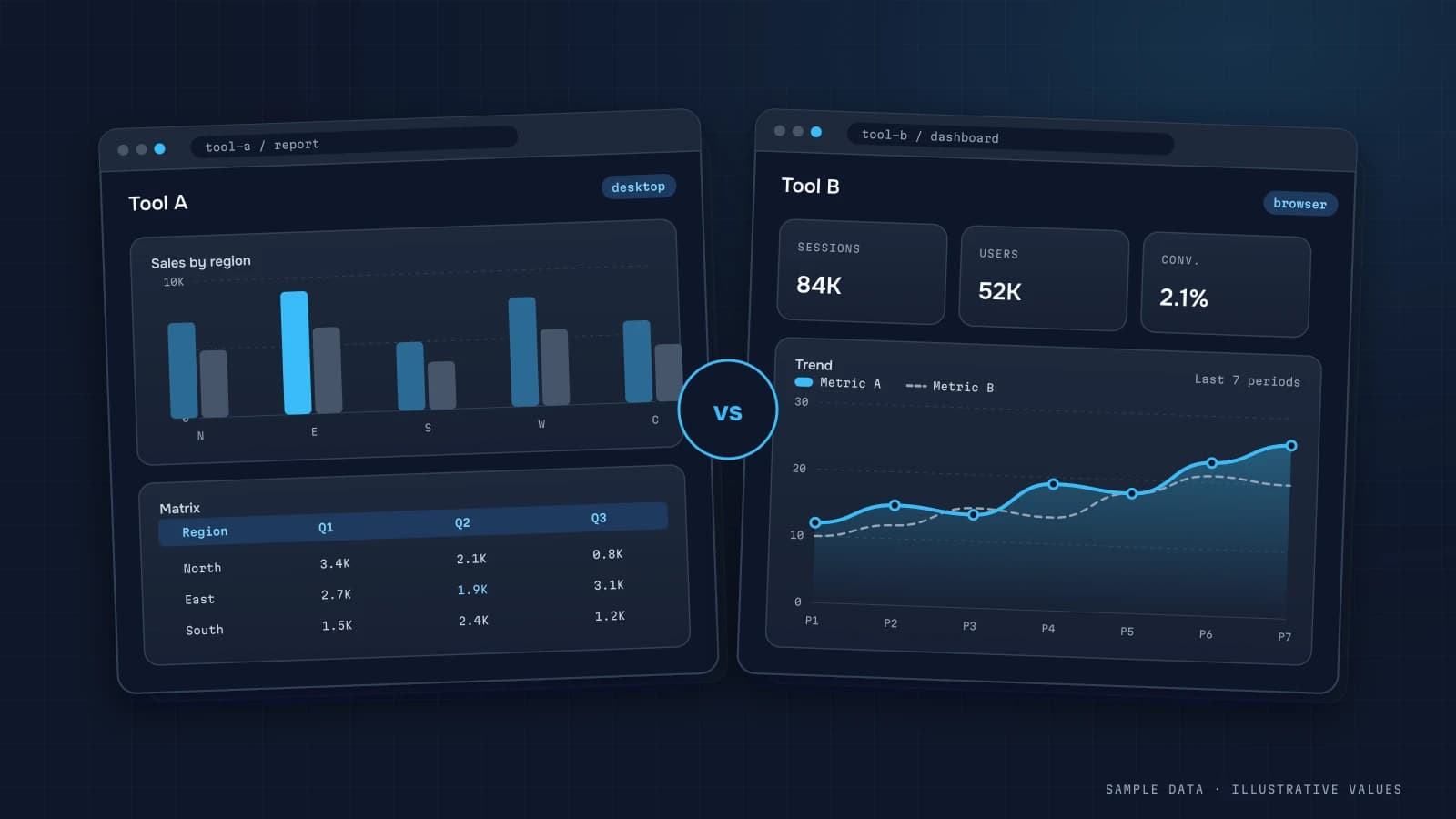
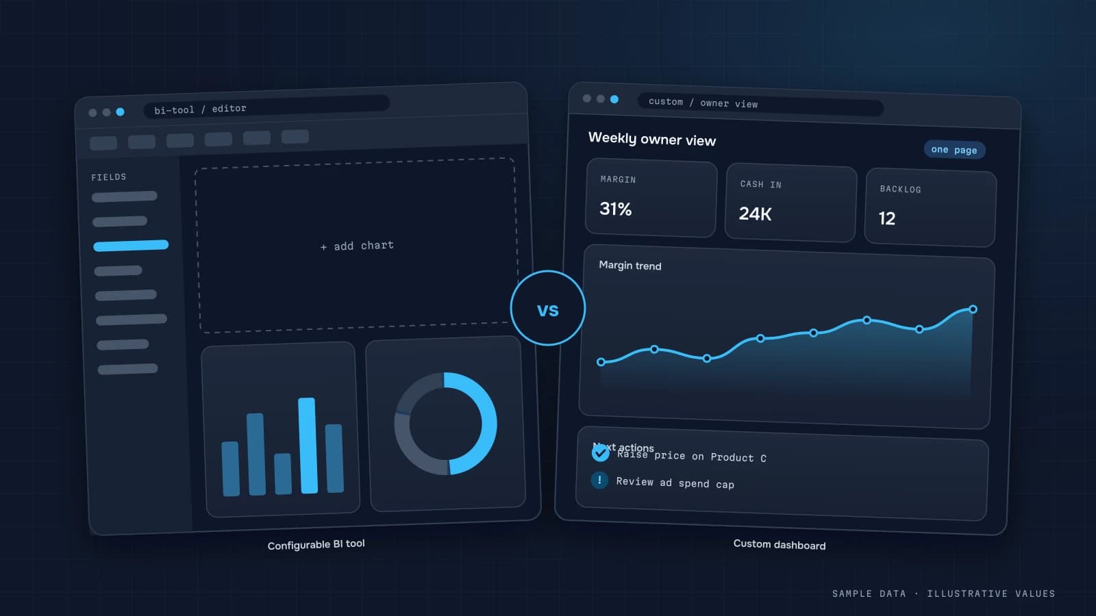
For choosing between tools, see custom dashboard vs BI and Power BI vs Looker Studio.
The building blocks
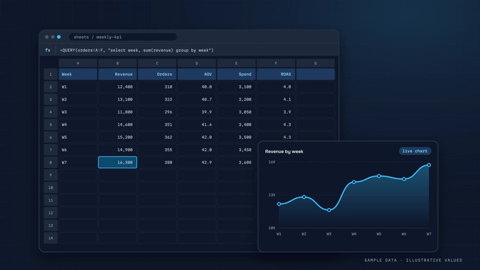
- Data prep: aggregate to the level you need (days, channels, categories) in SQL, Python or right in the sheet. Only aggregates go on the page, never raw data.
- Layout: 3–6 KPIs, 2–4 charts, a table and written conclusions. A micro-dashboard is a story told with numbers, so the conclusions matter more here than on a daily dashboard.
- Build: a static site generator or a simple frontend that reads JSON at build time.
- Publish: push to the repo and it deploys automatically.
Example: scheduled rebuilds with GitHub Actions
name: rebuild-dashboard
on:
  schedule: [{ cron: '0 5 * * *' }]   # daily at 05:00 UTC
  workflow_dispatch:
jobs:
  build:
    runs-on: ubuntu-latest
    steps:
      - uses: actions/checkout@v4
      - run: python scripts/export_data.py   # pulls aggregates; keys in secrets
        env:
          SHEET_ID: ${{ secrets.SHEET_ID }}
      - run: npm ci && npm run build
      - uses: actions/upload-pages-artifact@v3
        with: { path: dist }
Secrets (API keys, sheet IDs) belong in the repository settings, never in the code.
Access and confidentiality
The big caveat: a static page is public by default. If the data is commercial:
- Vercel offers password and SSO deployment protection on certain plans;
- Cloudflare Access in front of any host adds login by email code or corporate SSO;
- GitHub Pages with access control for private repos requires paid GitHub organisation plans;
- whichever you use, publish aggregates only and no customer personal data.
Obscure URLs aren't protection. Links get forwarded, and they get indexed.
How long it takes
With finished data, typically 1–2 weeks: a day or two to understand the data and draw conclusions, a few days for layout and build, and the rest for revisions. Writing the conclusions takes longer than writing the code.
What works well
- Headline conclusions above each chart ("Repeat purchases rose after the email launch"), not "Chart 3."
- Comparisons with the previous period or with plan.
- Annotations on charts for events, promotions and price changes.
- Methodology at the bottom: sources, dates, metric definitions.
- Print and PDF support, because investors forward files.
Visual principles are in dashboard design best practices. If your data still lives in spreadsheets, see Google Sheets dashboards.
Common mistakes
- Publishing raw data that contains personal information.
- Treating an unguessable link as security.
- Piling on filters, at which point it's a different product.
- Leaving off the data date.
- Keeping API keys in the repo.
Checklist
- Data is aggregated, with no personal data
- 3–6 KPIs and 2–4 charts with headline conclusions
- Data date and methodology shown on the page
- Access protected (Vercel protection / Cloudflare Access) if the data isn't public
- Secrets stored in CI settings
- Checked on mobile and in print
Step by step: building one
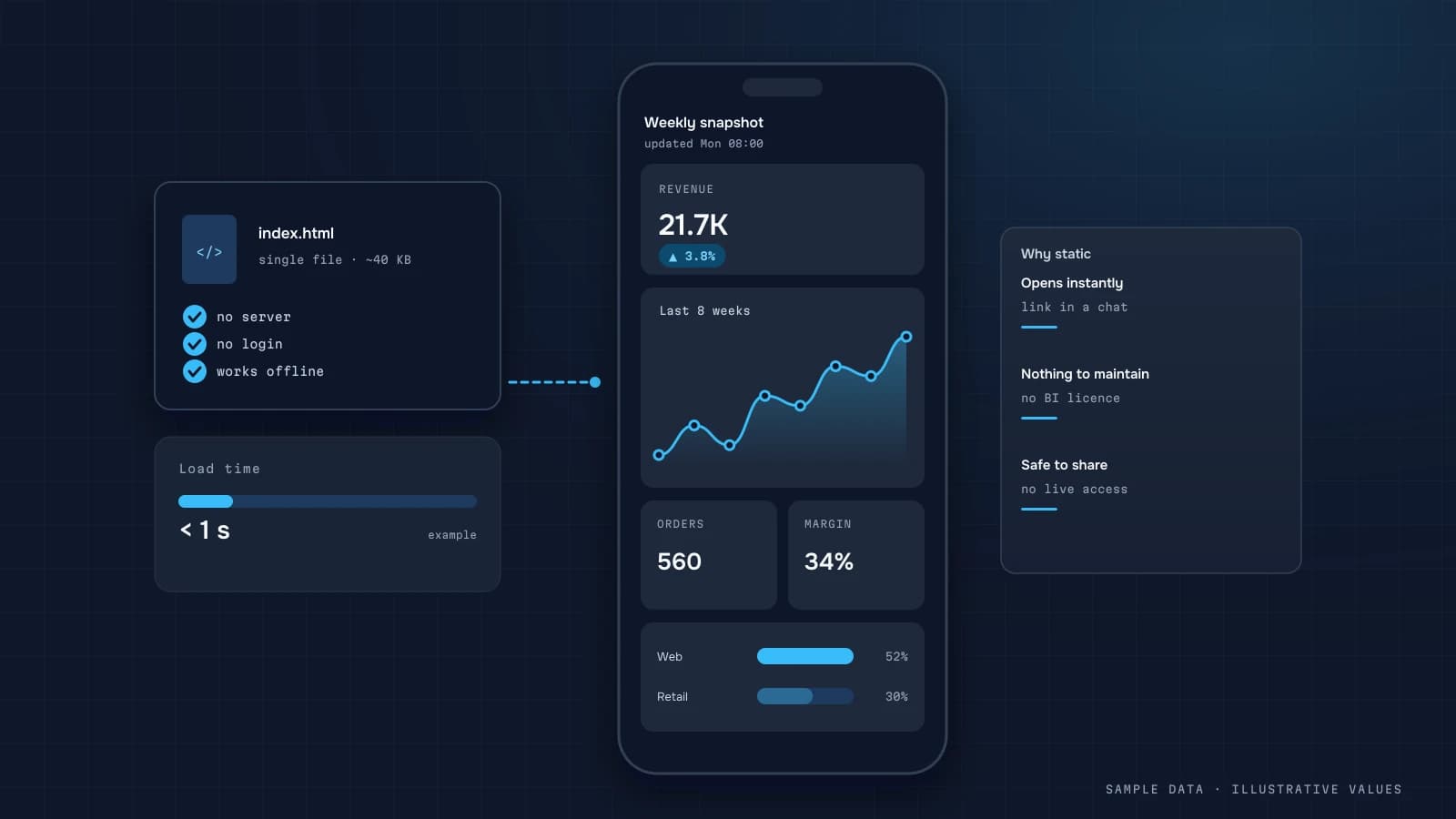
A static micro-dashboard is a single HTML page generated on a schedule from your data, with no BI tool and no live database connection. The build:
- Write the query that produces the handful of numbers and series the page shows, usually 4–6 KPIs and 2–3 small charts.
- Render to HTML with a template: numbers in plain markup, charts as inline SVG or a small charting script with the data embedded as JSON.
- Publish to static hosting behind access control (see below), or attach the file to a message.
- Schedule the generation after the nightly data refresh.
import json, datetime as dt
from string import Template

data = query_summary()          # {"kpis": [...], "trend": [[date, revenue], ...]}
html = Template(open("template.html").read()).substitute(
    updated=dt.datetime.now().strftime("%d.%m.%Y %H:%M"),
    kpis="".join(f"<div class='kpi'><span>{k['label']}</span><b>{k['value']}</b>"
                 f"<i class='{'up' if k['delta']>=0 else 'down'}'>{k['delta']:+.0%}</i></div>"
                 for k in data["kpis"]),
    trend_json=json.dumps(data["trend"]),
)
open("out/index.html", "w").write(html)
The page loads instantly, works on any phone, and can't break because a BI connector changed. The trade-off is that it shows exactly what you designed and nothing else. That's often a feature.
Worked example: what goes on one screen
For a service business owner checking in from a phone (illustrative):
| Block | Content |
|---|---|
| Header | "Updated today 07:00", period selector as two links: week, month |
| KPI cards | revenue, bookings, utilisation, no-show rate, new clients |
| Chart 1 | bookings per day, last 28 days, with the same period last year as a faint line |
| Chart 2 | revenue by service category, horizontal bars |
| Table | top 5 staff by utilisation, with a ▲▼ vs the previous week |
| Footer | link to the full dashboard, data sources, contact |
Generating two versions (week and month) as separate files is simpler than adding interactivity, and the "selector" is just two links.
Performance and accessibility
Because the page is static, it's easy to make it fast and accessible:
- Total page weight under ~200 KB, with no external fonts needed
- Charts have a text alternative (a short summary or a data table)
- Colour contrast meets WCAG 2.2 AA, and changes are marked with ▲▼, not only colour
- Readable at 360 px width without horizontal scrolling
- The update time is always visible
When to move beyond it
| Signal | What it means |
|---|---|
| People ask to filter by things you didn't pre-generate | time for an interactive dashboard |
| More than ~10 versions of the page to generate | the static approach is getting unwieldy |
| Several teams with different questions | separate dashboards per role, see business dashboards |
| Need for drill-down to individual orders or clients | a real BI tool or a custom workspace |
Many businesses keep the micro-dashboard even after that, as the morning glance for the owner, while the team works in the full tool.
What it costs to maintain
Maintenance is minimal: the template rarely changes, and the query changes only when metric definitions do. The main risk is a silent generation failure, where the page quietly stays on yesterday. So make the update time large and visible, and have a failed generation send an alert like the rest of the pipeline.
One more practical tip: keep the previous day's file next to the current one (index.html and yesterday.html). When someone asks "what did it show yesterday morning?", you have the answer without rerunning anything, and a quick diff of the two files is a cheap sanity check that today's numbers moved by a plausible amount.
FAQ
How is this different from a slide deck?
It's interactive (tooltips, period switches), opens from a link on any device and can update itself automatically.
Can it connect to live data?
It can rebuild on a schedule, hourly or daily. If you need real-time data and filters over raw rows, you need a full workspace.
What does hosting cost?
GitHub Pages and Vercel have free tiers for small projects. Access protection and commercial use may need a paid plan, so check the provider's terms.
Who updates the data?
If the source is a Google Sheet, update the sheet and the scheduled build picks up the changes.

DATUMPANEL — Business data analytics
DATUMPANEL is an independent data analyst based in Ukraine. I build dashboards for business owners, set up GA4 and the BigQuery export, and run data pipelines and Telegram auto-reports for e-commerce, service businesses, SaaS and agencies, from data audit to decisions.